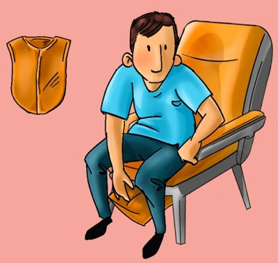
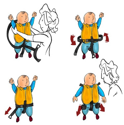
They wanted to create cartoon style for the safety card design. So this was my first try. The color theme was inspired by their official website. Yet, the design somehow look too stiff.
After they chose my to design their safety card design, they asked me to redesign the safety card to be more cartoony. The person who contact me also sent his drawings as referrence. I though it was too cartoony, so I told him to let me do some drawing first, just to get the desired look and will send back to them.
 |
| The first doodle from PIC |
 |
| Some of my sketches |
 |
| More sketches |
 |
| More sketches with colors |
 |
| Another sketches with colors |
 |
| More... sketches |
After we agreed on desired look, I continue to put all those images into layouts and put them in order. This design was the first layout with the desired cartoon look.
They we're ok with the layout, but they need approval from airline traffic control authority to get the design printed. It was quite a while until then the traffic control responded with some revisions. They wanted to have more clearer message on the safety card. Such as the no smoking panel, they wanted to add red cross circle in front of the smoky guy. And we also get rid of the language panel, so it will use only english language.
Here's the final design.
This fun project was using Inkscape, pixelmator and sketchbook pro. All drawings were drawn on bamboo tablet with sketchbook pro. Some touch ups made on Pixelmator. Finally all images were arranged in Inkscape, as well as the typo and some text panels / arrows.


Komentar
Posting Komentar
Monggo komennya